Does your business need an amazing landscaping business website?
An improved website design?
Does your current website struggle to provide a steady stream of Landscaping Leads?
Keep reading if you answered “yes” to any of the above!
Outline:
- Why a great landscaping website still deeply matters.
- What to put on your website:
- Conversion Rate Optimization: (More leads, NOW.)
- Headlines & Sub Headlines
- The Hero Section
- Your Call to Action (CTA)
- Images
- Conversion Rate Optimization: (More leads, NOW.)
- Choosing the right platform
- Platforms/CMS and why you should choose what.
- Landscaping Website Design Examples (Handpicked)
About Lawn Marketing Edge
Why we think this is worth your time.
At Lawn Marketing Edge, we are obsessed with digital marketing that works and have over 10 years of building high converting, great websites in over 90 niches before specializing in Lawn & Landscaping Digital Marketing. The ideas below are our passion and we don’t take it lightly. We hope it’s a genuine help to you and your business.
Landscaping Website Design: Why it’s important (Updated 2024)
For most landscaping companies, no platform is more of a 24/7 sales engine for your business than its good old “www dot”(aka Website).
Even with the growth in social media platforms, video content and the like, a website is still an absolutely essential marketing tool for your landscaping business.
We remember the “if you build it, they will come” days of the Internet. Now, you’re almost guaranteed to have a couple of competitors with decent websites and a solid reputation. Just having one isn’t what makes you stand out. The “What” you put on your site is the difference maker.
This guide is your edge. If you follow this, you can almost be guaranteed improved performance to your business bottom line.
Along with being a 24/7 sales engine, your website will also be:
- The primary place your new customers look to determine your credibility, research your services, and discover more about your company.
- The primary way Google learns about your business as an entity (along with Google Business Profiles) and why they should rank you and your business for the (likely) hundreds of local searches for the exact services you provide.
- A tool to streamline your most annoying tasks, like hiring & support
- A place to share your expertise.
- A tactical advantage (if you know how to).
- Obsess over their Hero Section
- Complete the SEO “Big 5”.
- Treat the right pages like doors.
Let’s discuss how to make landscaping websites that convert consistent, high-quality landscaping LEADS.
CONVERSIONS: Begin with the end in mind.
I’m starting here because let’s be honest… you don’t actually want a landscaping website.
You want the RESULTS of a landscaping website. IE. Traffic, Forms, Calls, Applications, Support Tickets…etc.
People spend $10,000+ dollars on a website design and miss this basic aim. The vision gets clouded, budgets get strained and the website just flops.
The best landscaping websites should have (at least) these four key goals
- Create an immediate, high-trust introduction to your brand & offer.
- Compel new customers to convert to a call or form lead.
- Simplifying support for existing client service & sales.
- New hires/staff applying for a job**
Yes, I know there are other reasons, but for now, make all of these secondary to your primary objectives.
In most cases, the “other reasons” are just sub-steps to your primary goals.
- I want it to create SEO traffic… (Why? So potential clients convert)
- Well, I also want it to showcase my landscaping services. (Why? So they can convert)
- I want it to have a modern design. (Why? See what I’m doing here…)
- I want to showcase my landscape design. (So…visitors become paying clients)
- I want to show my service area. (So they can become paying customers)
- It needs to be mobile-friendly. (Because…. 🙂
- I need social media links… (Don’t make me say it…)
Ok, of course, we want conversions — but how?
It’s worth a complete guide, so we’ll have to be brief here, but I’ve broken this down quickly into some of the most important steps.
4 Critical Elements to Skyrocket Your Conversions
- Focus
- Calls To Action
- Trust Elements
- High-Quality Images
- Reviews
- Social Proof
- Headline & Sub Headlines
#1) Know Your Business’ Focus:
This is where most companies go the most wrong. They try to be everything to everyone. The truth is the internet is a very noisy place, and people need to know what you’re amazing at quickly.
Start by choosing a “Focus Service”.
To help, put yourself in one of two categories:
- We are a Landscaping Company that also does “X.” (Lawn Care, Maintenance, Irrigation…etc.)
- We are a Lawn Care Company that also does “X.” (Landscaping, Mulch, Lawn Pest management..etc.)
It doesn’t matter what the “also” is, it matters that you’ve picked a lane you’re MOST about.
This can be tough. Few landscaping companies can be about a single service or even a group of services. Eventually, your clients will want you to do it all. But you should still clarify what you will be most about internally with your team, marketing, or yourself.
What is your unique style, selling point, specialty…etc.
Next, pick a focus service area.
Now, I know this is typically a complex conversation. You likely serve many areas and that’s a good thing.
The best way to clarify this is by asking, “If I could make all of my business revenue goals by serving just one city or service area, which would that be?”
Often, this isn’t where the business operations are actually located; it’s often where your ideal clients are in the most volume that still makes economic sense to service.
Why? Because space is limited on a website. Areas like your “SEO TITLE” often need to carry service area keywords but only allow 60 characters. You’ll be forced to choose at some point.
We recommend building a page for each service area rather than cramming them all into your homepage.
ACTION STEPS:
- List all of your services in descending order of importance from a business perspective.
- List your service areas in descending order of importance, to you, from a business perspective.
- Then use a tool like Ahrefs or AdWords keyword planner to compare these lists against search volumes in your area.
If you want help with determining your focus, we’d highly recommend you Book A Strategy Session ASAP, as space is limited! We can discuss your focus and provide detailed keyword research to confirm your direction.
#2) Call to Action Language & Buttons
Once you know your focus, attracting your ideal clients with the correct offers will be much easier.
You probably think you should get your headlines done first, wrong.
Before making a great headline/sub-headline, you must know what you plan to ask your visitors to do.
Think how different these two asks are.
Landscape Designer: “Get your customized Landscape design.”
Lawn Mowing: “Get a quote in 1 hour, or the first cut is free.”
Now, think how different the support images, copy, and language would need to be to maximize each CTA’s effectiveness.
CTA’s are among your page’s most important elements, and there are some rules of thumb you can easily follow to be effective.
- Always list your most important CTA (boldly) in the upper right corner of your site and in your hero section.
- Repeat these requests often and in slightly different ways.
- Surround them with phrases and facts that make people feel safe to take the next step with you.
- Don’t overthink the language. We surveyed 125 of the top landscaping websites across the country, and the top 3, accounting for roughly 13% of all CTA’s surveyed, were “Contact Us, Get a Free Quote, and Request a Quote”.
What your calls to action say isn’t nearly as important as how visually striking they are.
I use the ‘blur’ test when assessing if the next action is clear and obvious to the user.
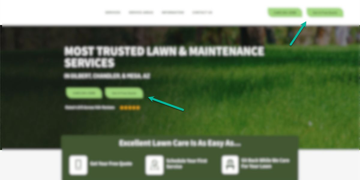
They must stand out and be repeated often. Most don’t want to turn people off by being too “asky”. It rarely does, and if the rest of the site is done at a decent level — nobody will care.
Lastly, a good website homepage always makes it easy to find contact details. It’s not about fancy widgets; simply big phone numbers and a clear place to reach out are surprisingly hard to find on some sites.
ACTION STEPS:
Decide what your core lead generation call to action needs to be. In most cases, this will be either targeted directly towards your focus service call to action or be broad enough to accommodate all calls to action. Here are some of the most common.
- Contact Us Today
- Schedule Your Design Meeting
- Learn More
- Schedule a FREE Estimate!
- Request A Quote
- Get Started
- Let’s Get Started
- Get a Free Quote
- Request a Consultation
- Book Your Estimate Today!
#3) Your Trust Assets.
Next, you need to decide how you will build trust.
Trust Assets are distinct marketing elements that only exist for one reason — they quickly build trust in your ability to fulfill the offer.
The best landscaping websites are littered with Trust Assets.
They can be visual or written, but once you start to see them, you’ll notice them everywhere. Here are some common examples.
- Years of Experience
- Badges
- Associations
- The number of customers served.
- Testimonials
- Reviews..etc.
- Endorsements
- Videos
- Before and After Photos
- The list goes on and on.
The best way to grasp the unique nature of “trust-building elements” is with statements like:
Family Owned & Operated
What does this statement have to do with the quality of your landscaping work?
The answer is — nothing.
It’s there because of the perception that a family-owned and operated business is more trustworthy than a corporate machine. If you’re family-owned, lean into it. If you’re the corporate machine, you could go with visual trust assets like pictures of your staff that convey a family-like work environment.
People scan for Trust Assets like this, constantly. It’s like checking a trust checklist we don’t even know we have. It’s been developed over a lifetime to keep ourselves safe.
You need to find and document what would make a completely cold customer from the internet believe you’re a great choice with their hard-earned dollars.
ACTION STEPS:
- List out how you currently build trust and ways you could but aren’t. If you don’t have many, you need to acquire more of these things before your website can be wildly effective.
- Listen to your next sales call or interaction with a customer you’re trying to sell. Chances are you speak these Trust statements in every sales call you have — it’s essential the website says these things.
- Create a plan to start acquiring better Trust Assets. (More Reviews, Better Before And After Photos…etc). Throw all of these into a folder for your next website developer. When you hire them, they may fall out of their seats with joy :).
#3.1) High-Quality Images:
Let’s talk images (in the Trust Asset context).
Are custom images always better?
It depends. Do they create trust? Do they clearly convey quality? Do they answer questions or support your focus CTA? I recommend stock photos all the time because they do a better job than our client’s current visual assets.
For Example: If you are just starting out and only have 1-2 decent before and afters, go with “Our Featured Projects” and just showcase enough to get the point across and then fill the site with high-quality stock photos of the type of work you know you’ll do someday.
Some of the best ways to use your custom images will be:
- Pictures of your best landscaping.
- Pictures of the most marketable team members.
- Screenshots of your most compelling reviews
- Visual representation of your service quality, your software systems, your office environment.
- Before & Afters
- Badges
To start implementing this, make a list of the images currently at your disposal before you start a redesign or website build. This should include Logo/Branding. These are some of the most important images you have.
This will help you know the raw materials of persuasion that you have to work with.
If you have 10-20 high quality photos, you’ll be able to develop a site that uses highly visual styles to convey your skill. Plan to make your portfolio page a main feature.
Don’t have great images, you’ll need to work good stock photos into the site to carry the design, but you’ll absolutely need other trust elements to build the actual trust in your brand.
For example, this site has beautiful examples of their work in action – and they lead with it.
The quality is immediately established — I.E. Trust.
[Image: Site 162, Hero Section]
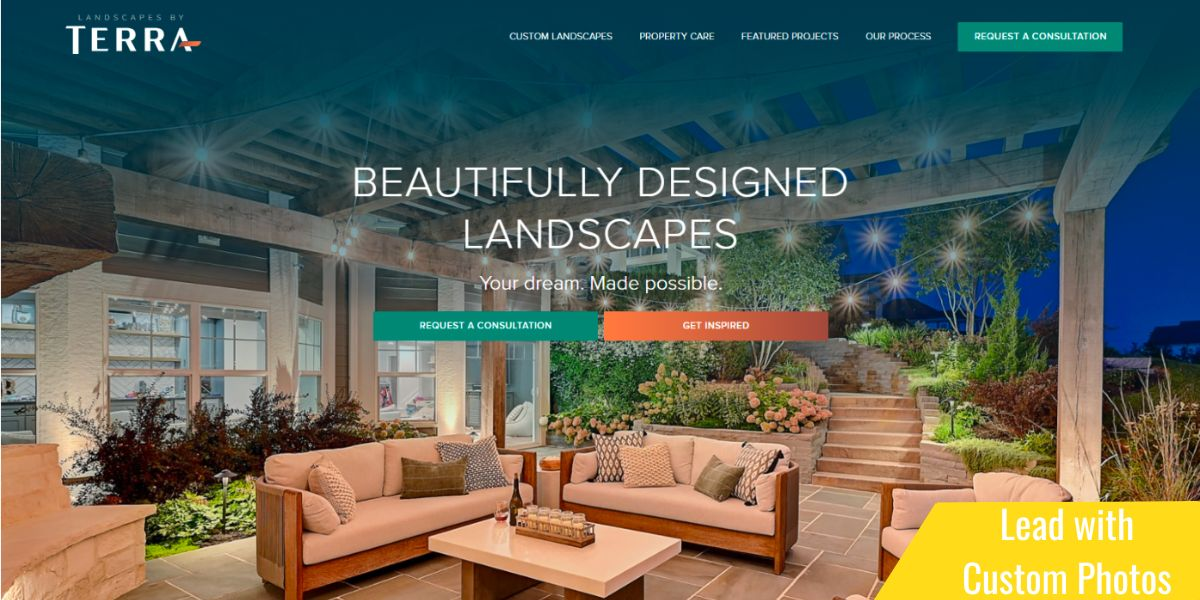
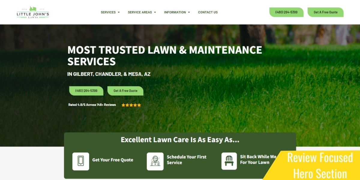
This is a great use of stock photos, headlines & reviews working together to convey trust. The image here is just support, but you would feel very differently about this header of those 5 stars, and the review reference wasn’t there to let you know the quality of the company behind the stock photo.
Have very marketable Leadership?
Make them a clear, marketable persona of your site. This image is perfectly paired with a trust-building message.
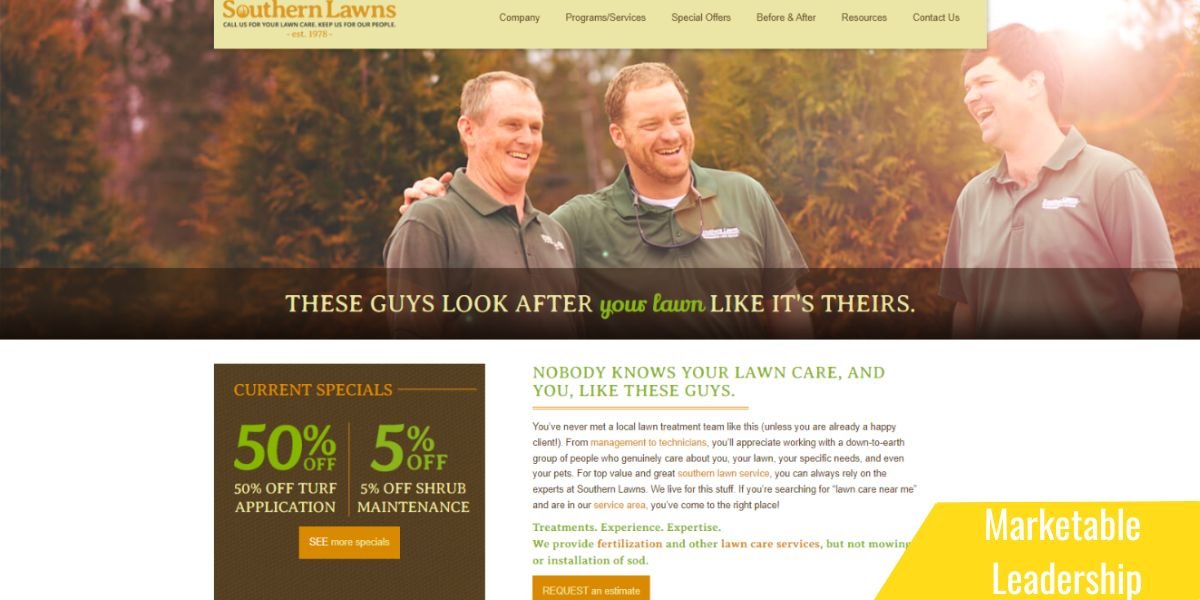
Designing around your companies best trust assets can turn average websites into amazing landscaping websites, even without a big budget.
Action Steps:
- Continue documenting the best trust-building elements you have, focusing on imagery.
- Does your logo look good? Consider updating it before you build a site around it.
- Create a folder and drop the best media you have into it. Images, videos, before and afters, screenshots of happy client emails, or text messages.
#4 Your Hero Section Headlines & Sub Headlines
Lastly, your headlines/Sub-headlines convey the value.
Again, your focus pays off hugely here.
Your focus area tells you if your homepage can be dedicated to one area or needs to encompass many.
Which service should win? Of course, you do more than just one.
#1 LANDSCAPING SERVICES [Insert City]
#1 LANDSCAPING SERVICES [Insert Region]
This will also help guide your plan for search engines. But we’ll get to that.
Headlines need to focus on the value you’re creating or your customers felt need.
See the major difference you feel about these two companies just by their clear focus.
[Site: 162 IMAGE of Landscaper] [site 131: Image of Lawncare]
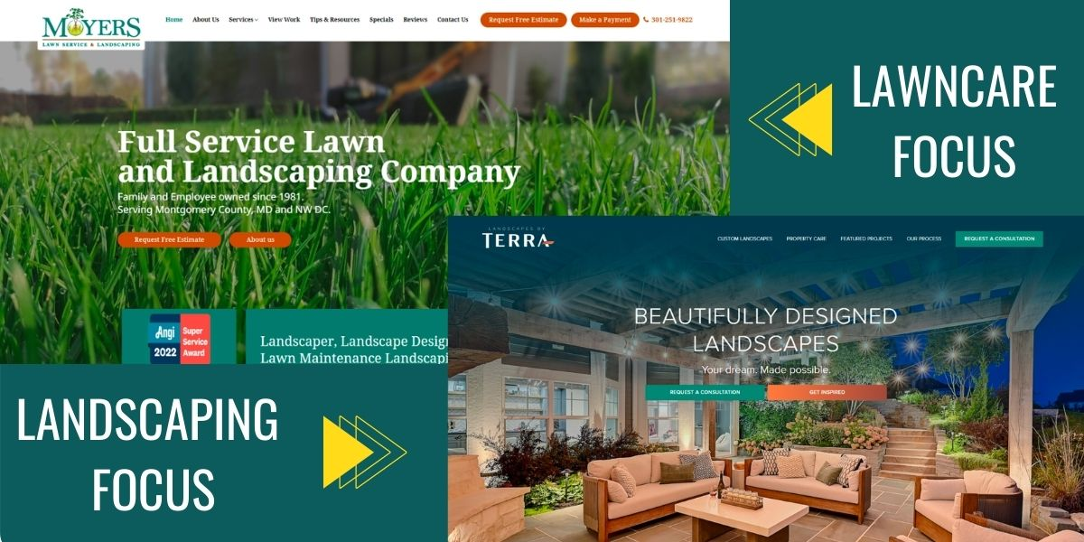
I love to use Testimonials for headline or sub-headline copy.
“Dude, this actually worked! I put zero trust in marketing until working with you all.”
Pulled directly from a client testimonial… This perfectly conveys what we are doing for clients, but the trust is just layered in because it’s coming from a client with a great landscaping website design.
We surveyed over 150 of the nation’s best landscaping websites and here’s 8 headlines samples to get you thinking:
- Transform Your Outdoor Space
- Unleash Your Landscape’s Potential
- Your Dream Lawn, Realized
- Experience Nature, Elevated
- Elevate Your Outdoor Living
- Expert Care for Beautiful Landscapes
- Revolutionize Your Landscape Design
- Your Landscape, Our Expertise
Your Landscaping Website Platform Matters!
Ok, let’s talk about the technical here. This isn’t the sexiest stuff, but these decisions will matter in the long run!
Where to build your website: CMS
Your Landscaping Website System or Content Management System
We’re going to keep this top level to avoid going to deep into geek speak, but the “thing” you actually build your website on is called a content management system.
You’ll hear people say things like, “WordPress is better for SEO than “Wix” or “Squarespace”…etc. These are comparisons of these CMS and there are pros and cons to each.
A dead simple way to organize this is to think about the types of CMSs.
We’ve bolded the leader in each category for quick review.
Type 1: Open Source CMS:
These are websites that you must purchase separate website hosting to accompany the CMS. These offer maximum flexibility and customization but often require more technical expertise. The codebase is open source, meaning there’s no “company” you’re paying for the code and there are communities with plugins and add-ons that can be added for cheap functionality upgrades. own website
Examples:
- WordPress (54% of Landscaping websites that we researched were WordPress)
- Drupal
- Joomla
Type 2: SaaS CMS (Software As A Service)
These are websites that are a closed ecosystem that a single organization runs. Generally, they have restrictions in place to protect themselves and their users, and this limits customizations. You also must pay them a monthly fee to use this service, but this will include your hosting costs so that you won’t pay for both. Typically monthly costs will be between $40 – $199/mo. The website will still feel like “yours” but the bottom line is you’re in a closed ecosystem and at the mercy of the SAAS company you’re paying.
Examples of SAAS for landscaping websites.
- Squarespace
- Wix
- Weebly
- Hubspot
- Shopify
- Webflow
- Duda
Quick Tip: OUR TOP Website CMS Recommendations:
#1 WordPress: (Growing Business Solution)
If you have some web development ability, or some developer help, or enough time to dedicate to watching a fair amount of youtube tutorials – there’s no more scalable or flexible platform than wordpress with a good page builder theme like Elementor. It will be the best long term plan for most landscaping websites or lawn care websites and a most of the pro’s you’ll eventually want to work with will have no problem working with a WP site long term.
#1 Wix: DIY or Beginners For do-it-yourselfers, this is a decent starting point for your first landscaping or lawn service website. Their templates can allow you to build a professional appearance as a beginner with minimal monthly costs. In the long term, you’re almost guaranteed to need to migrate to WordPress as soon as you involve a professional.
In our survey of over 100 of best landscaping websites in the US, 54% of the websites were built on wordpress with the next closest being only 6%. Join our email list to learn which CMS it was!
Type 3: Professionally Assisted
You will likely want to partner with a professional landscaping web agency sometime in your business life. These pros also choose a CMS and what they choose will have the same pros/cons.
For example, SAAS-based website builders like Squarespace, Wix, and Weebly almost always reach a limit to the custom abilities of the CMS. They have a scaling ceiling.
Some have even developed their own custom CMS. This usually means a very stable site that will have few issues once developed (a good thing) but the “next” company will likely have little ability to manage the site and will almost certainly recommend rebuilding the site on an open-source solution like WordPress. It also means that any advanced functionality must be custom developed by that team. What can be done with a $99 WordPress plugin, might be $10,000 in custom development.
Look For:
- A transferrable environment.
- Clear ownership language. Are you “buying” the website or essentially “using” the website while working with that company?
- “What happens when we cancel?”
- Low-cost support.
- **Pro Tip: Never, ever, allow the pro you’re working with to own your domain name. Allowing access to the domain name is usually fine, but you should always pay that bill yourself and maintain direct access to it.
Landscaping website builders we’d avoid:
Obviously, there will be companies out there that have probably built great solutions using the below. But as a rule of thumb, we’d generally recommend other solutions over the below options.
- Godaddy’s Website Builder: Maybe you could build your first basic site with this for cheap and easy, assuming that you’ve bought your domain on Godaddy, this will make it simple to go live on the cheap. But, the lack of sophistication and low quality starts to turn off customers immediately and the largest cost is the business you don’t get because your website stinks.
- Hubspot: Costs can escalate quickly, there are better solutions that do the same thing. Getting locked into Hubspot’s ecosystem can be expensive to leave and maintain. This isn’t to say a pro team that recommends Hubspot wouldn’t be a great option, some of the best landscaping websites we’ve seen use Hubspot.
- Shopify: If you’re selling products too… then maybe… but there are probably better options.
And that’s a wrap! Put some of these to practice and watch your Landscaping Website conversion skyrocket!
| Lawn & Landscape Websites | Landscaping Websites |
